StudyTogether
A collaborative study platform designed to help students build accountability, discover study partners, and share resources around shared learning goals.
Project at a Glance
StudyTogether is a web platform designed to address the isolation many students experience when studying alone. The project focused on creating an accessible, community-driven space where students can find accountability partners, share notes, and coordinate study sessions, all within a clean, distraction-minimal interface.
Studying Alone in a Connected World
Many students, especially those in online programs or large universities, struggle to find consistent study partners and resources. Existing tools like Discord or group chats are too unstructured, while learning management systems offer no social discovery layer.
The challenge was to design a platform that felt purposeful and focused: easy to find the right study partners, easy to organize sessions, and simple enough that it didn't become another distraction.
Key Design Goals
- Enable quick, relevant study partner discovery
- Keep the interface low-friction and distraction-free
- Support async and real-time collaboration modes
- Design accessible interactions for diverse learners
- Build trust through profile transparency and shared goals
How We Got There
Interviewed students across academic levels to understand how they currently find study partners and what makes those relationships succeed or fall apart.
- User interviews (6 participants)
- Survey analysis
- Competitive analysis
- Empathy mapping
Identified core user needs and frustrations, then translated them into a focused problem statement and feature priority framework.
- Persona development
- User journey mapping
- HMW statements
- Feature prioritization
Built out the information architecture, then moved from sketches to mid-fidelity wireframes to a polished high-fidelity Figma prototype.
- Site map & IA
- Sketches & wireframes
- Hi-fi Figma prototype
- Design system components
Ran unmoderated usability tests via Maze, analyzed drop-off points, and redesigned problem areas before final prototype handoff.
- Maze unmoderated tests
- Task completion analysis
- Design iteration
- Final documentation
Final Design
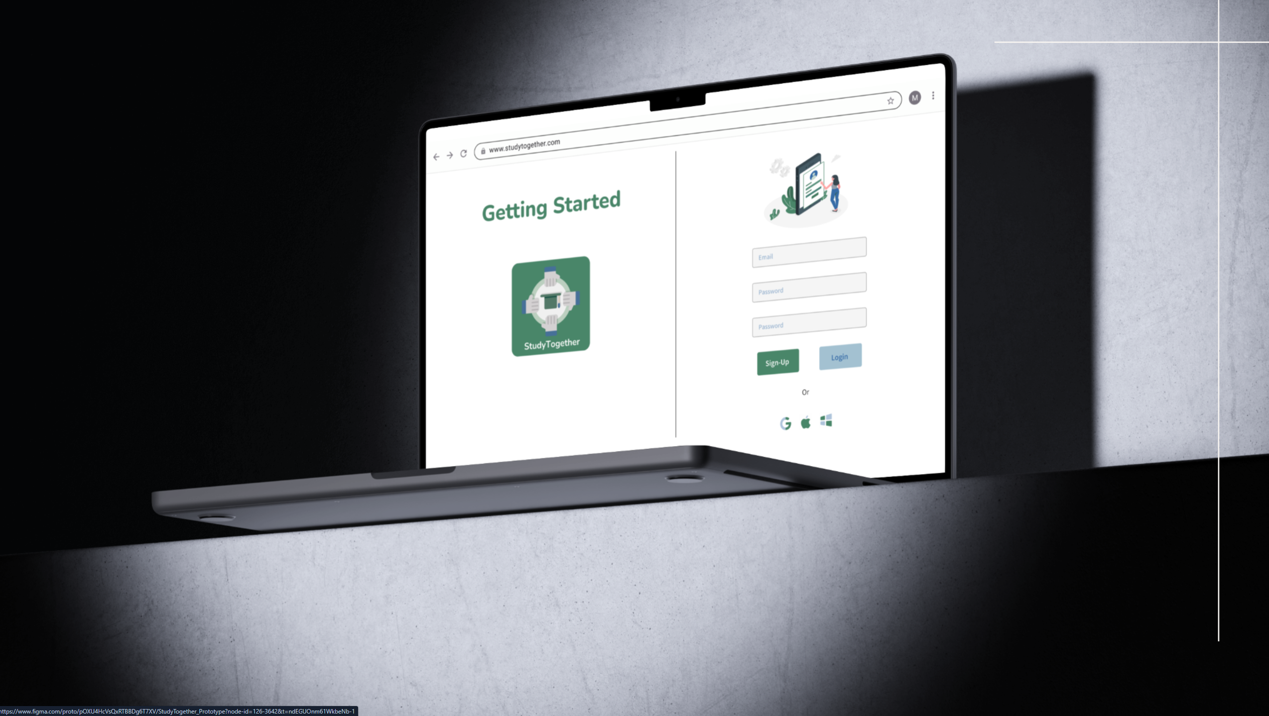
What We Achieved
Designed a clean partner-matching flow that surfaced relevant students based on subject, schedule, and study style preferences.
Simplified the session-scheduling feature after testing revealed users wanted fewer steps between finding a partner and booking time together.
Delivered a comprehensive Figma file with components, annotations, and interaction notes ready for developer handoff.
Ready to Work Together?
Let's design experiences that are thoughtful, accessible, and built around your users.